
We hit play on a new era for Cambrooke
The challenge: more than a packaging update
Cambrooke, a specialist nutrition brand supporting people living with the rare metabolic conditions Phenylketonuria (PKU) and Tyrosinemia (TYR), had something genuinely significant to announce. Its GMP nutritional drinks were getting a new screw cap – a resealable, twist-off closure replacing the old silver foil seal.
Simple, right? Not quite.

The challenge wasn't to communicate a packaging change. It was to communicate what that change could mean to people living with PKU or TYR. Both conditions require lifelong dietary management, with a carefully controlled low-protein diet and specialist nutritional formulas forming part of everyday life. So, having a formula that fits around the day matters. The old foil seal offered little flexibility once opened. No resealing it, no putting it away and picking it up again later.
The new screw cap changed that. Twist it open when you're ready, reseal it, and come back to it when you need. The brief was to launch the new cap in a way that felt genuinely meaningful to real people living real lives.
The insight: life has a rhythm, and managing PKU and TYR shouldn't interrupt it
People living with PKU and TYR don't see themselves through the lens of their condition. They're students, commuters, gym-goers, parents, friends. They move through the world like everyone else – they just have to be more deliberate about what they consume and when.
The old foil seal could break that rhythm. Once it was open, there was no resealing it and coming back to it later. There was no fitting it around a meeting, a lesson, a commute. The new resealable cap quietly changed all of that. You could get on with your day, stop when you wanted, take a drink, seal it back up and carry on. The cap gave users back something small but significant: control over the moment.
That was the insight. The new cap doesn't change the formula. It changes the day.

The solution: Play. Pause. Repeat.
Three words. Three media player icons the world already understood instinctively. A campaign that felt less like healthcare communications and more like a celebration of getting on with life.
Play – get on with your day. Keep moving, keep living, keep going. Pause – when you're ready, twist it open and stop for a drink, on your terms. Repeat – reseal it, slip it in your bag, and pick it up again later. The headline mapped directly onto the new cap's behaviour and more importantly, onto the rhythm of real life with PKU and TYR.
We developed an illustration style built around that rhythm; warm, energetic, line-drawn characters going about their days with a Cambrooke carton naturally in hand. Working at a laptop. Mid-call with headphones on. Studying from a book on the sofa. Each scene framed within a loose, hand-drawn media player panel, with the Play, Pause and Repeat icons landing not as decoration but as the visual punchline to each moment.
The supporting copy gave each word of the headline its own weight:
Play = life is moving to a rhythm, to a beat. School. Work. Gym. Friends. This is not "press play to drink." It's "press play on your day."
Pause = life interrupts, the beat pauses, the music stops. Meetings. Trains. Lessons. Calls. Pause = twist it open. Stop for a drink. Flexible convenience, on your schedule.
Repeat = reseal it. Pick it up again later. Repeat = routine. Repeat = reliability. Repeat = consistency without compromise.
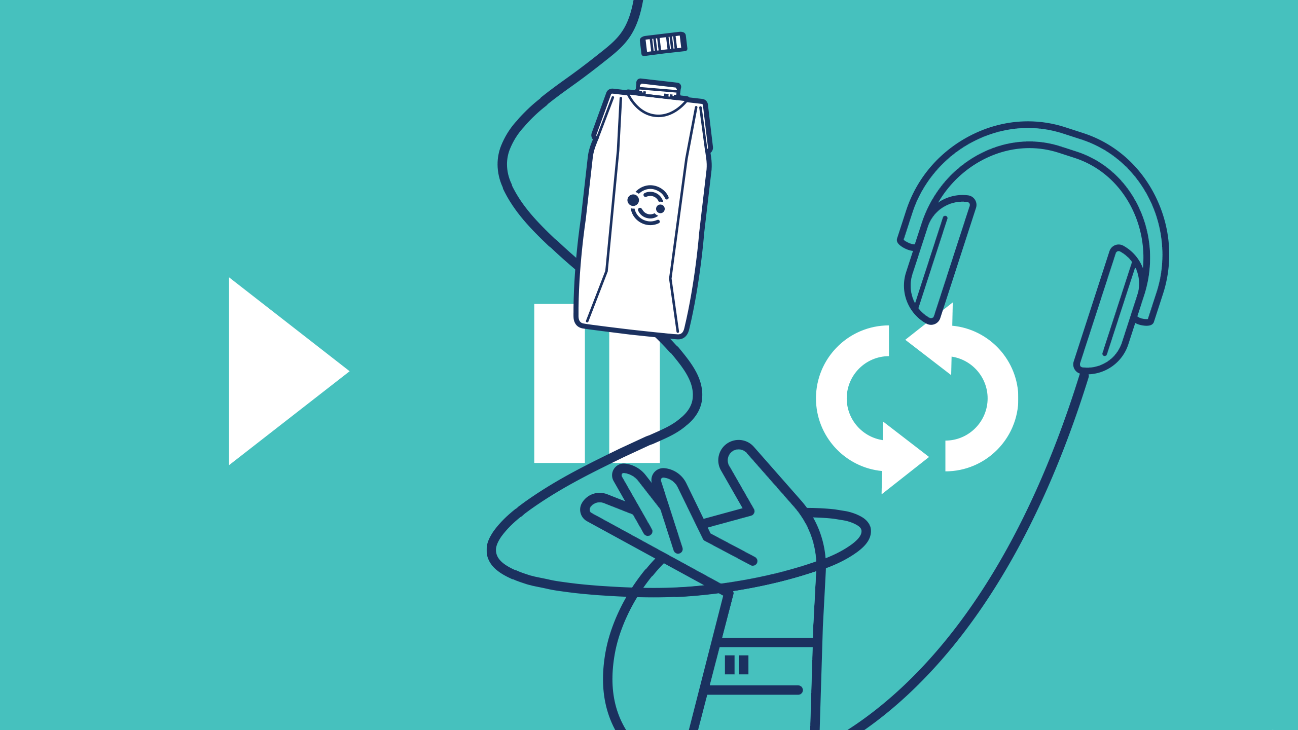
The hero: an animated film
The campaign's centrepiece was a fully animated film – the asset everything else was built around. Set to the Play. Pause. Repeat. framework, the animation brought the illustration world to life: characters moving through their days, pressing play on school runs, work calls and quiet evenings, pausing to twist open their Cambrooke carton when a moment presented itself, then resealing and carrying on. The media player icons punctuated each scene with the satisfying clarity of something clicking into place.
Rather than a product demo or a clinical explainer, the film felt more like a short celebration of ordinary life, the kind of day PKU and TYR patients actually have, with the new cap quietly enabling it. The animation set the visual language, pacing and emotional tone that then carried across every other touchpoint in the campaign.

Digital and social
The key visual translated into a series of individual social assets one post per word of the headline giving the campaign a natural three-part rhythm of its own. Each post led with the illustration and its icon, with copy that kept things direct, warm and human. The product appeared in-scene rather than on a pedestal, reinforcing the message that this is nutrition that fits around life, not the other way around.

Website
The campaign hero landed on the Cambrooke homepage, running at full width across desktop and mobile. The line "The new resealable cap doesn't change the formula" sat beneath the key visual; a deliberate reassurance for existing users that what they trusted was still exactly the same. Just easier to live with.

Pull-up banner
For clinical settings and events, the campaign extended into a vertical pull-up format, stacking the three illustrated scenes so the Play → Pause → Repeat narrative read naturally from top to bottom. The supporting copy — "You can't beat the classics" – anchored Cambrooke's product heritage, while the new cap gave every conversation a fresh reason to start.

Sample box
The campaign extended into the most direct touchpoint of all – the sample box sent to new and prospective Cambrooke users. The exterior carried the Play. Pause. Repeat. icons on a full brand-teal ground, with the line "Press play on your day. Pause when life moves. Repeat your life's beat." – making the first physical impression of the brand an immediate statement of intent. Open the lid and the campaign continued inside: the key visual, the three illustrated scenes, and the headline "The new resealable cap doesn't change the formula – it simply keeps up with the beat." But perhaps the sharpest idea in the box was also the smallest – three QR codes, one beneath each word of the headline, each linking to a curated Spotify playlist that matched the sentiment of that moment. A playlist to keep you moving for Play, one to soundtrack a pause for Pause, and one built for the comfort of routine for Repeat. The media player metaphor didn't just live on the packaging. It played.


The impact: a campaign that felt as good as it looked
Play. Pause. Repeat. gave a packaging update the cultural weight it deserved. Rather than simply announcing a product change, it became a statement about what Cambrooke understands about the people who rely on their products: that managing PKU or TYR is part of their everyday life, and the products that support them need to move with them.
Led by an animated film and carried through a consistent visual language across every touchpoint, from pull-up banners to social posts, the campaign was distinctive, warm and immediately recognisable. More importantly, it spoke to PKU and TYR patients in a register they rarely hear from healthcare brands, one that acknowledged their lives as full, busy and absolutely worth celebrating.
The new cap didn't change the formula. The campaign changed the conversation.


The sample kit has now been sent to all clinics across the DACH region and has been incredibly well received. Since launching the campaign across our website and social channels, we received 34 sample requests in the last month alone, a really significant number given the niche area in which we operate.
This response demonstrates a clear appetite amongst our customer base for something different, engaging and fun. A huge thank you to everyone involved in making it a success!