Brand Development, UX,
Web Design and Build for
Make My Blinds
The short story
Make My Blinds is an eCommerce-only retailer specialising in a huge range of made-to-measure blinds — bringing fun and humour to the buying experience.
Fiora was briefed with repositioning the Make My Blinds brand — disrupting the market with distinctive branding and an intuitive website that simplified the buying process.
With no high-street presence and a saturated online marketplace, we needed a bold strategy that would propel the brand into the spotlight. In order to do that, we had to challenge the view of shopping for blinds being boring and difficult, and emphasise just how important the choice of blinds could be to the home.
The results
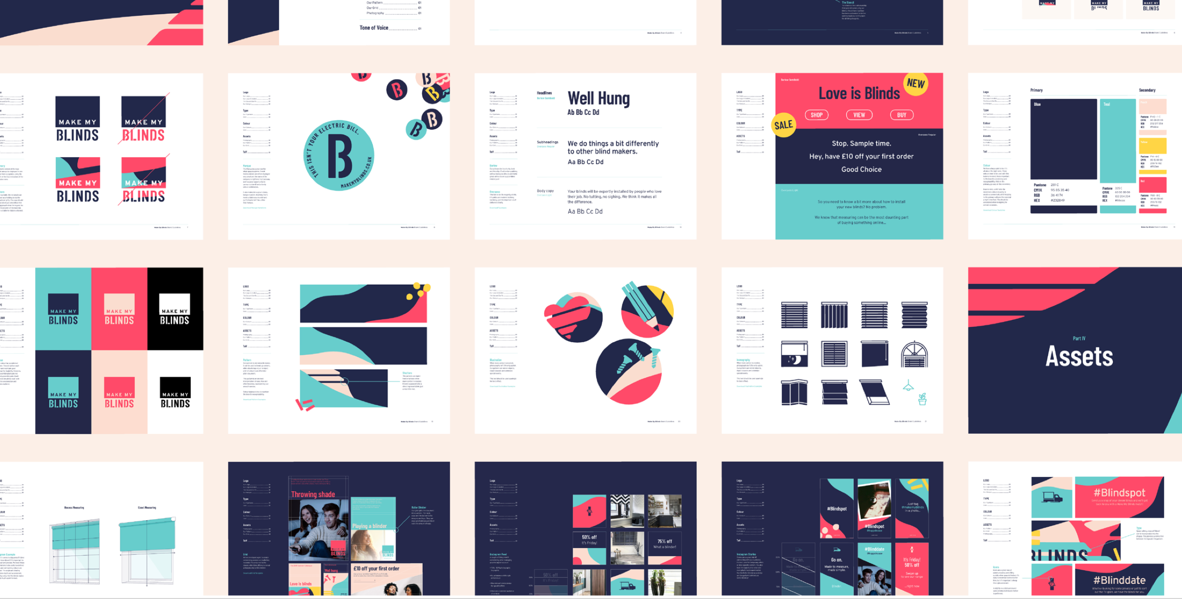
Through our strategic insight, humour and focus on the consumer journey, we created an intuitive website that echoed the vision, values and personality of the brand. We developed a deep understanding of our audience and their needs that fed a brand strategy based on the idea that Make My Blinds, Makes Your Home.


With no high-street presence and a saturated online marketplace, we needed a bold strategy that would propel the brand into the spotlight. In order to do that, we had to challenge the view of shopping for blinds being boring and difficult, and emphasise just how important the choice of blinds could be to the home.
The results
Through our strategic insight, humour and focus on the consumer journey, we created an intuitive website that echoed the vision, values and personality of the brand. We developed a deep understanding of our audience and their needs that fed a brand strategy based on the idea that Make My Blinds, Makes Your Home.

The long story
The discovery phase
The first step was to create a website that Make My Blinds could boast about. The existing site needed some UX and CRO work, with a confusing layout and unintuitive setup slowing down the user journey and buying process.
In order to learn specific customer pain points, we recruited testers from the brand’s core audience demographic — women aged 25-45, looking for a quick and easy way to set up blinds on their own. We held discovery sessions filming the tester as they searched for and ordered a specific set of blinds.
These sessions helped to highlight small yet pervasive issues that were affecting the user journey, from confusing pop-ups that disrupted the check-out process to a muddled categorisation that slowed down searches.

The 4-step process
In order to simplify the user experience, we began wireframing a new site that took into account client requirements and tester-feedback. With the site inventory consisting of a range of styles, sizes and colour variations, we needed to create a visual guide that would help consumers navigate the site and order their set of dream blinds.
To project a simplistic, succinct user journey, we emphasised a clear 4-step process:
- Measure your window.
- Enter measurements.
- Pick your fav blinds.
- No-fuss install.
This provided users with a fundamental guideline to follow, while raising their confidence in their ability to buy and install blinds on their own.


Simple design for a clearer journey
Through the use of a cool, simple colour scheme, clear categorisation and detailed icons, we made the site layout and search navigation as easy to follow as possible. Even if a user didn’t know the specific name of the blind they wanted, with just a few clicks and some visual cues, they’d be well on their way to finding a suitable option.
Once they’d found a blind, inputting measurements and adding customisation elements was quick and simple, while an auto-populate function enabled measurements to be applied across all products, drastically reducing input time.
A disruptive tone of voice
We had a clear design that reflected the simplicity and energy of the brand — but we weren’t finished yet. Looking at other made-to-measure blind companies we noticed the tone of voice was the same across the board — aspirational, informative but lacking any real fun.
We wanted Make My Blinds to shake up the marketplace and showcase a disruptive, youthful and humorous spark that differentiated them from other retailers. Our inspiration ended up coming from the two young owners of the brand themselves, and we echoed their playful, down to earth humour in our copy.
While an overabundance of cheeky puns and pop-culture references would overwhelm the reader, we found the balance between clarity and humour, focusing on bold headlines complemented with clearer more information-focused copy.


