Colour, that vivid expression of light, shapes our perception of the world in profound ways. It's not just a visual experience but a complex phenomenon that involves physics, biology, and the cultural interpretations assigned to various hues. To unravel the mysteries of colour, we've delved into the insights of experts who've spent years exploring its nuances and how it's perceived. Moreover, we'll navigate the technical landscapes of colour spaces like RGB and CMYK, and how light's interplay influences the colours we see.
The Science and Perception of Colour
At its core, colour is the result of light interacting with our eyes and brain. Sir Isaac Newton's experiments with prisms in the 17th century laid the groundwork for understanding colour as a component of light. Fast forward to the modern era, scientists and artists alike have furthered our comprehension of colour. Experts like Josef Albers, who authored "Interaction of Color," and Johannes Itten, known for his work on colour theory in art, have explored how colours interact and affect us emotionally and psychologically.
Johannes Itten's colour theory, which categorises colours into primary, secondary, and tertiary hues, and discusses concepts like colour harmony, is foundational for both artists and designers. Albers, on the other hand, focused on the relative nature of colour, showing how our perception of a colour can change based on its context.
Diving Into Colour Spaces: From RGB to CMYK
When discussing colour in the digital and printing worlds, RGB and CMYK colour spaces are fundamental. RGB, standing for Red, Green, and Blue, is the colour space for digital screens. It's an additive colour model where light is added together to create various colours; the more light, the closer we get to white.
Conversely, CMYK - Cyan, Magenta, Yellow, and Key (Black) - is a subtractive colour model used in colour printing. Unlike RGB, where colours are created by adding light, CMYK works by subtracting brightness from white light, reflecting only specific colours. This model is fundamental in the printing industry, ensuring that the colours seen on screen can be accurately (to a point as any designer, artworker and printer knows colours do not always translate from one colour space to the next) reproduced on paper.
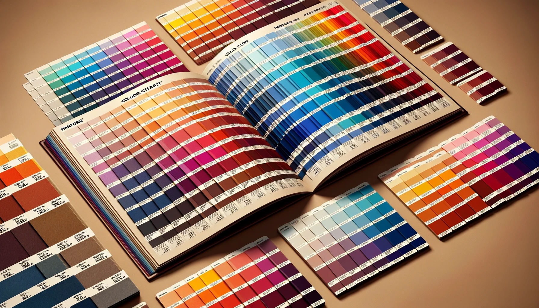
The Impact of Light and the Role of Pantone
The way we perceive colour is immensely influenced by light. The type, intensity, and angle of light can dramatically alter the appearance of a colour. This phenomenon is known as metamerism. It's a crucial consideration in industries like painting, design and fashion, where colours must look consistent under various lighting conditions.
Pantone has become a global authority on colour, providing a universal colour matching system that helps designers, manufacturers, and brands ensure colour consistency across various materials and products. Each year, Pantone selects a "Colour of the Year," influencing product development and consumer trends across multiple industries.
The Art and Science of Colour in Branding
For brands, the selection of colour transcends mere aesthetics; it's a critical decision that combines art with science, psychology with culture. Colour can significantly affect consumer behaviour, influencing how a brand is perceived and whether it resonates with its target audience. Experts in branding and consumer psychology, have emphasised the power of colour in establishing brand identity and emotional connection. The right colour can convey values, evoke emotions, and even influence purchasing decisions. For instance, blue often represents trust and reliability, making it a popular choice for financial institutions, while green is associated with health and sustainability, a go-to for organic and eco-friendly brands.
This strategic selection process is backed by extensive research and analysis, considering factors like market trends, cultural associations, and colour psychology. Brands meticulously test various hues to ensure they align with their desired message and appeal to their target demographics. This delicate balance of science and art is evident in the careful consideration given to colour in logos, packaging, and marketing materials, aiming to create a memorable and impactful brand experience. As such, colour becomes not just a component of design but a pivotal element in brand strategy, underscoring the profound influence colour holds in the world of marketing and consumer perception.
Technological Advances: Colour Sensors and Beyond
Today's technology allows us to "read" colours in ways that were unimaginable in the past. Colour sensors and spectrophotometers can detect and analyse colours with incredible precision, aiding in everything from quality control in manufacturing to ensuring the authenticity of artworks.
These sensors work by measuring the light reflected from an object and breaking it down into its RGB or CMYK components, depending on the application. This technology not only helps in accurately replicating colours but also plays a vital role in digital art and design, where colour accuracy is paramount.
A World Awash with Colour
Whether you're a designer, artist, or simply a colour enthusiast, the vibrant world of colour offers endless possibilities for exploration and inspiration. It's a realm where science meets art, technology enhances perception, and cultural nuances add depth to our understanding. In this colourful journey, every shade and hue tells a story, inviting us to see the world in ever-more vibrant ways.