Love them or hate them, streaming services are how most of us access the TVs and movies we want to watch. With how often we use these services, we’re bound to have gripes with their experiences. But beyond the somewhat annoying increase in adverts and promotional content, what usability aspects of these services would we like to change?
Netflix
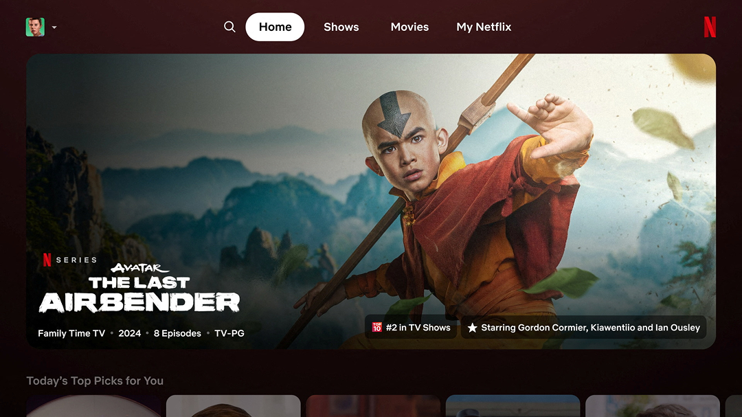
The longstanding streaming giant kicks things off with perhaps one of the most irritating features of them all. Imagine you are looking through the app to find a movie to watch. You find one you’re curious about and click on it to read more about it. Within a few seconds the movie itself starts playing in the background, leaving you to have to back out or let it play.
The obvious fix is to allow users to turn this off in the settings menu, but within the TV app Netflix doesn’t even seem to have one. Users have to login to a desktop to edit their settings. There you can turn off “Autoplay previews”, but this doesn’t actually affect the feature we described.
Disney+
Most streaming services have moved away from the endless sprawling grids of options, favouring more curated rows with large previews. This presents the user with less options at once and not get distracted by three other rows on their screen.
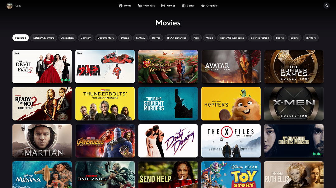
Disney+ has this too, but if you’ve ever tried to look for a film there you’ll have seen the insanity that is their Movies section. Although you can filter down by categories, you’re essentially presented with every film they have to offer, but with no clear sorting structure or order. Some users may prefer that to being presented with sometimes arbitrary rows of categories (often with overlaps), but its practicality falls flat without the ability to sort the list.
AppleTV
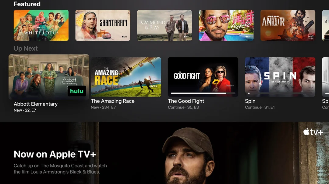
Perhaps it’s no surprise that our issue with AppleTV involves them arguably prioritising style over practicality. It’s a very simple and easy app to use, but it’s lacking one of the most important and basic features: clear active states.
When hovering over an option, its thumbnail enlarges slightly, and a subtitle is added below. What’s missing is an outline around the selected option, or even a change in background behind it, to make it clearer at a glance. Interestingly, they have clearer states when selecting individual episodes, so why couldn’t this be consistently applied across the app?
Prime Video
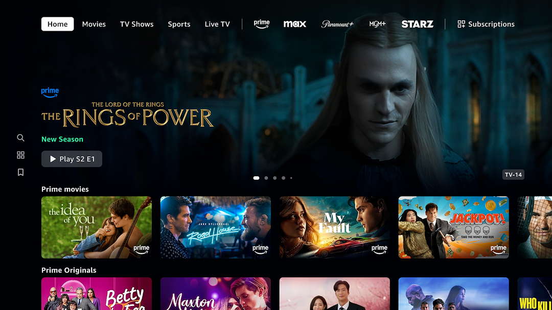
With the addition of third-party services to the Prime Video app, users need to know which service is offering a particular title. The solution is simply to show the logo of the service the title is from on its thumbnail.
The result, however, is a Prime logo plastered on to every single title you see. Someone browsing the Prime app doesn’t need to be told that a title is available on Prime, as that’s where they’re browsing. They do need to know when a title is only available with a third-party subscription, which is why our suggestion would be to only show third-party logos, not Prime.
HBO Max
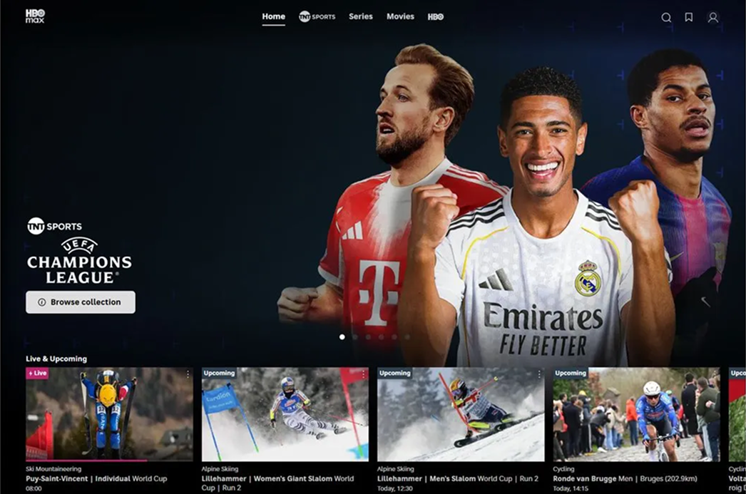
Our issue with HBO Max also relates to how they handle third-party services. As an optional addition to your subscription, you can access live sport through TNT Sport. The issue arises though when the display of said live sport is shown to a user before even their “Continue watching” section, regardless of whether they have the subscription to access it.
The need to advertise the extra service and its offerings is obvious, but it shouldn’t stand in the way of what a user is actually engaging with. Moving the section further down the page would allow users to encounter it when they’re more curious and browsing, rather than when they’re trying to resume a show.
Streaming services were supposed to make watching TV simpler. Instead, many have become cluttered, commercialised and frustrating to navigate. None of the issues above are particularly difficult problems to solve, which makes it all the more frustrating that they persist. When platforms prioritise promoting content, services and subscriptions over helping users find what they actually want to watch, the experience suffers. Streaming may have replaced traditional TV, but in many ways, it’s starting to make the same mistakes.