
Football holds a special place at Fiora. From our founder, David, who was deeply involved in football both as a player and as the Commercial Director at Bristol City, to Leanne, Dan, and myself to name a few. And then, Ted Lasso arrived. It's no exaggeration to say that my family was utterly obssesed by the show.
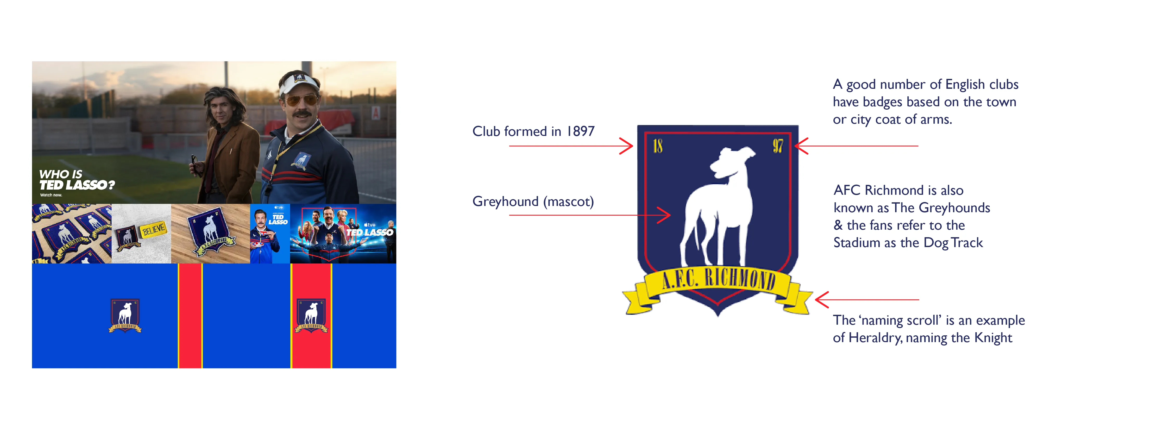
I’m sure many of you are familiar with ‘Ted Lasso’, the acclaimed Apple TV+ series? The show follows the various relationships and personalities within a fictional London-based football club known as AFC Richmond.
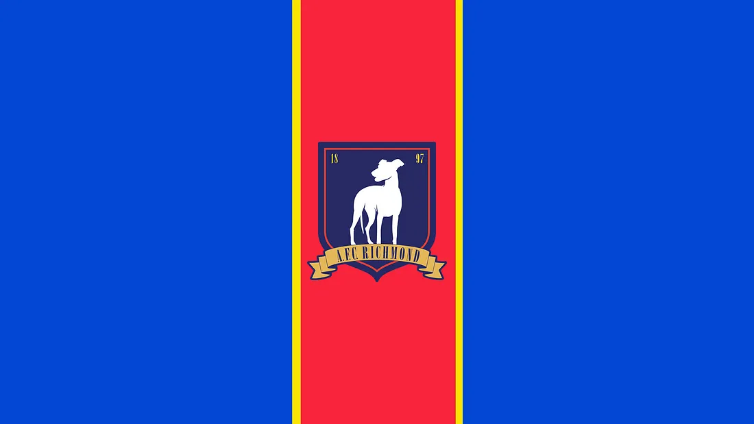
AFC Richmond is a fictitious English professional football club, situated in Richmond upon Thames, London, and features in the popular Apple TV+ series, ‘Ted Lasso’. At present, they compete in the Premier League, the top tier of English football, after securing promotion in 2021.
Established in 1897, the club played its inaugural match in the same year. Throughout the First World War, their home ground, the Nelson Road Stadium, was repurposed as a field hospital.
Ownership of the club was in the hands of Rupert Mannion until his then-wife, Rebecca Welton, acquired full ownership in the wake of their acrimonious divorce. This move followed revelations of Mannion’s repeated infidelities, often facilitated by the club’s Director of Football Operations, Leslie Higgins. Thank you Fandom for summary
As fond as I am of the show, I’ve always felt that the club badge was somewhat of an afterthought. Perhaps the producers were uncertain about the show’s prospective success? The badge has intrigued me since, and I’ve long wanted to delve into its design and potentially reimagine it.
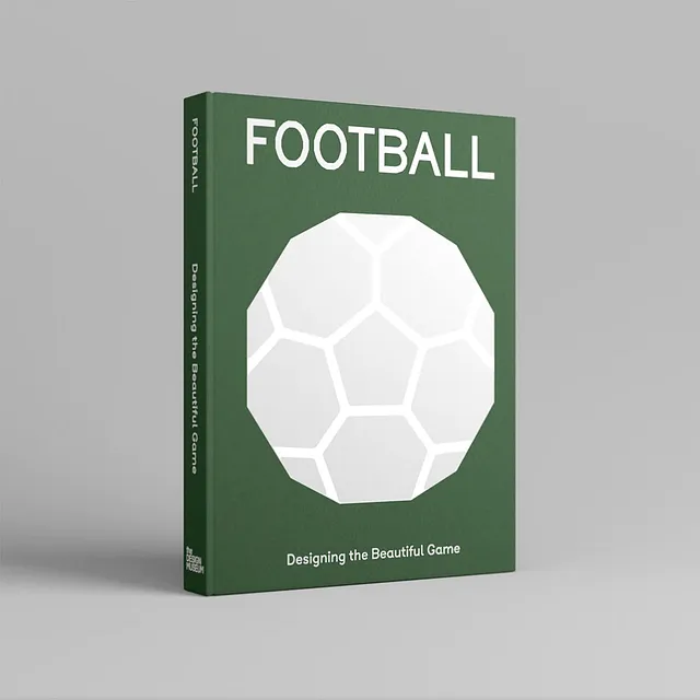
Fast forward a few years, we are now three series in, coupled with a wonderful book titled ‘Designing the Beautiful Game’ — a Father’s Day gift from my two sons — I’ve finally found the push I needed.
Add to this my personal involvement in youth football — specifically, coaching my sons’ team for a number of seasons — it supplied additional motivation. Further to this, my sons are huge fans of ‘Ted Lasso’ and its cast of unforgettable characters.
Each element of a club’s badge resonates with history; indeed, the badge is a symbol representing everything about the club. From the colours to the mascot and even the club’s nickname, every detail echoed in the badge reflects the club’s rich history.
Often, badges depict the unique character of the club’s locality, sometimes drawing inspiration from historic coats of arms and heraldry. With an understanding of the historical importance of UK football club badges, and recognising the fervent, almost zealous fandom associated with these clubs, I am keen to blend the heritage of AFC Richmond with a contemporary design aesthetic. While paying homage to key moments of the show.
The process began with a dissection of the current badge and an in-depth understanding of the origins of the badge. Given that the club is fictitious, there were naturally some gaps in the research. However, several key elements relating to the club’s history were addressed in various episodes. One historical aspect that needed to be acknowledged refers back to a ‘club curse’ Episode 6, Season 1 — ‘Two Aces’.
In this episode, when Jamie refuses to train, Ted turns to the talented new signing Dani Rojas, and the team is afflicted by an age-old curse. From IMDB
Spoiler Alert The curse alludes to a ‘dark history’ during the First World War when several hundred young men were duped into trying out for Richmond. This was, in fact, a ruse; army recruiters managed to conscript 400 local men to join the army’s ranks, many did not return.
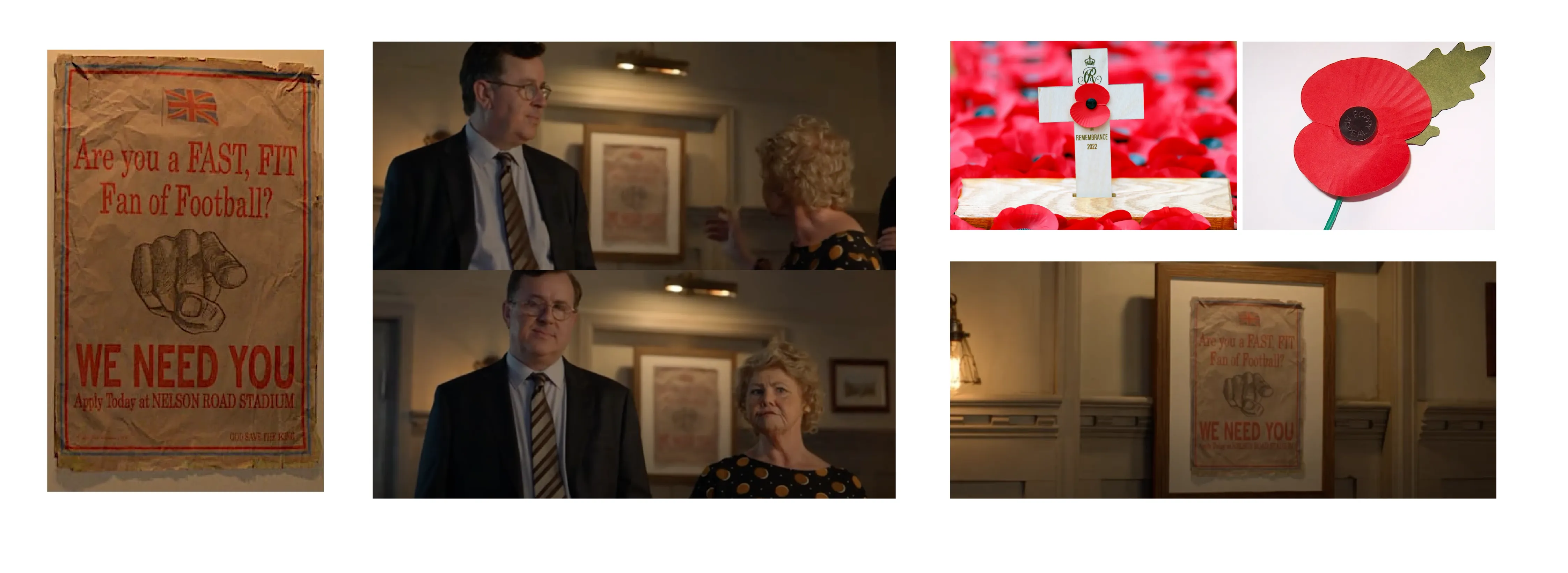
The Poppy serves as a poignant symbol of remembrance and is closely associated with Armistice Day (11th November). The poppy’s inception as a universally recognised symbol of remembrance can be traced back to the landscapes of the First World War. Poppies were a familiar sight, particularly on the Western Front. The flowers thrived in the soil that had been upturned by the ferocious battles and relentless artillery barrages.
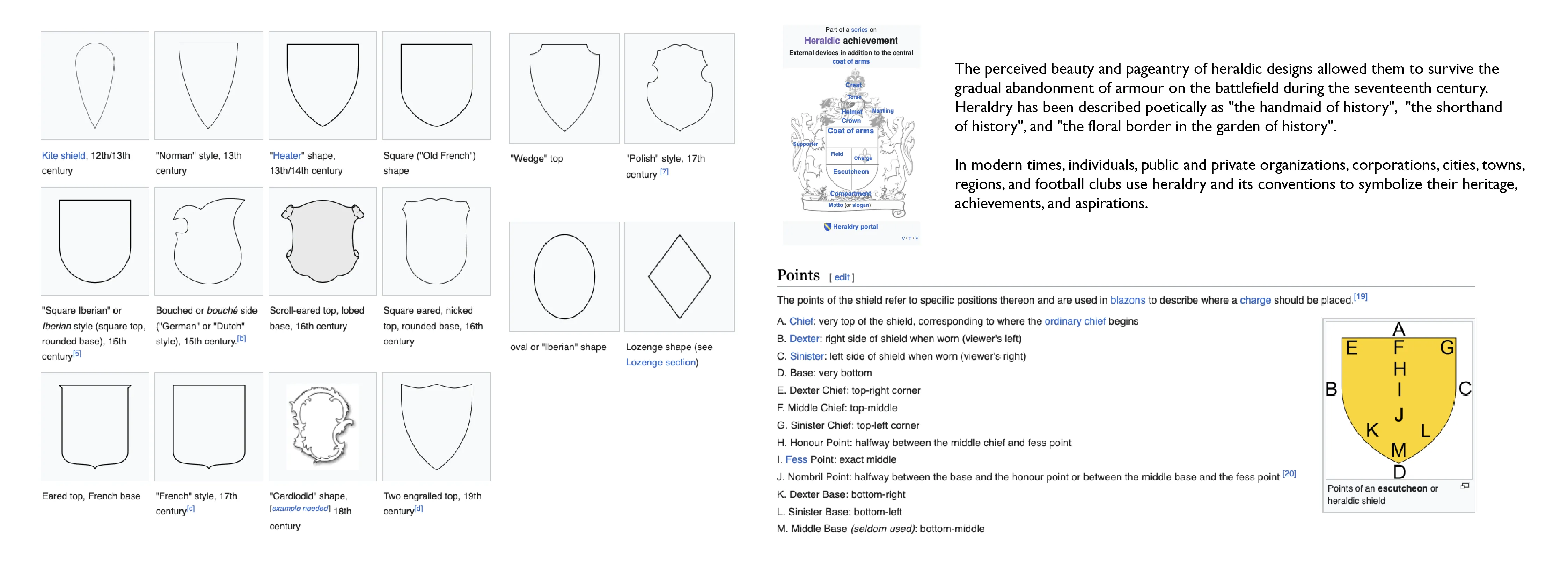
In heraldic tradition, the field (or background) of a shield can be segmented into more than one area, or subdivision, each distinguished by different tinctures. This usually follows the pattern of one of the ordinaries (fundamental shapes), inheriting its name (for instance, a shield divided in the form of a chevron is said to be parted “per chevron”). Shields can be divided in this manner for differencing (to avoid confusion with otherwise similar coats of arms), for the purpose of marshalling (merging two or more coats of arms into one), or simply for stylistic reasons.
The lines partitioning a shield needn’t always be straight, and there exists a specific system of terminology to describe patterned lines. This terminology is also shared with the heraldic ordinaries.
Various shield shapes were employed for the field in heraldic designs. Generally, only men and married women used a shield shape for their field arms. Unmarried women, and often male members of the clergy, would opt for a lozenge (diamond shape) or an oval. Many fields utilised in modern coats of arms are circular.
A shield design can convey a range of connotations including stability, protection, longevity, tradition, solidity, masculinity, toughness, boldness, and confidence. It signifies an unwavering stance of ‘no retreat, no surrender’.
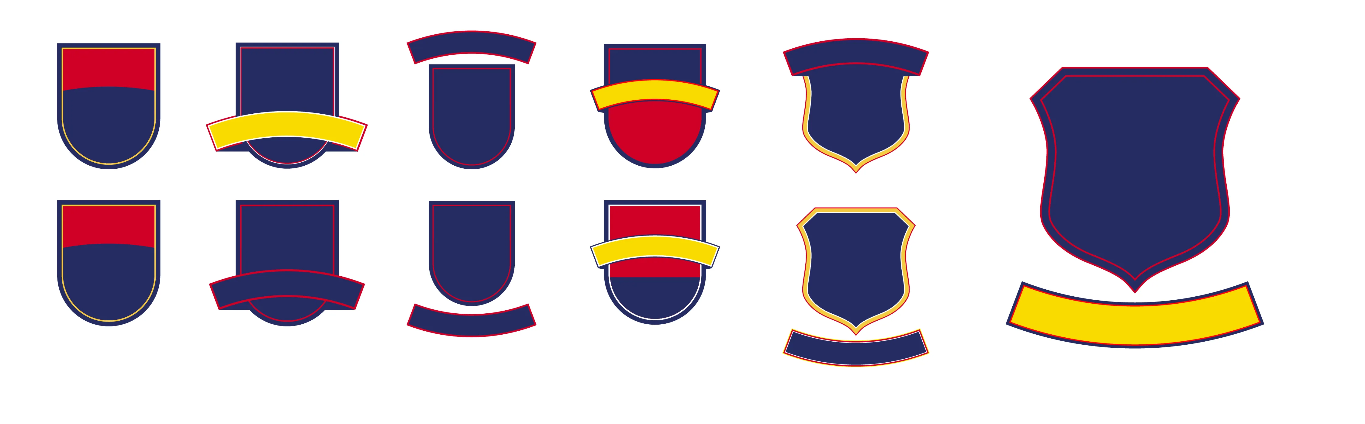
Expanding my knowledge of historical club badges and their links to heraldry led me to explore the evolution of shield shapes, particularly those from the 16th, 17th and 18th centuries. Given that the club was established in 1897, it seemed fitting to choose an 18th-century shield as a reference for the club badge.
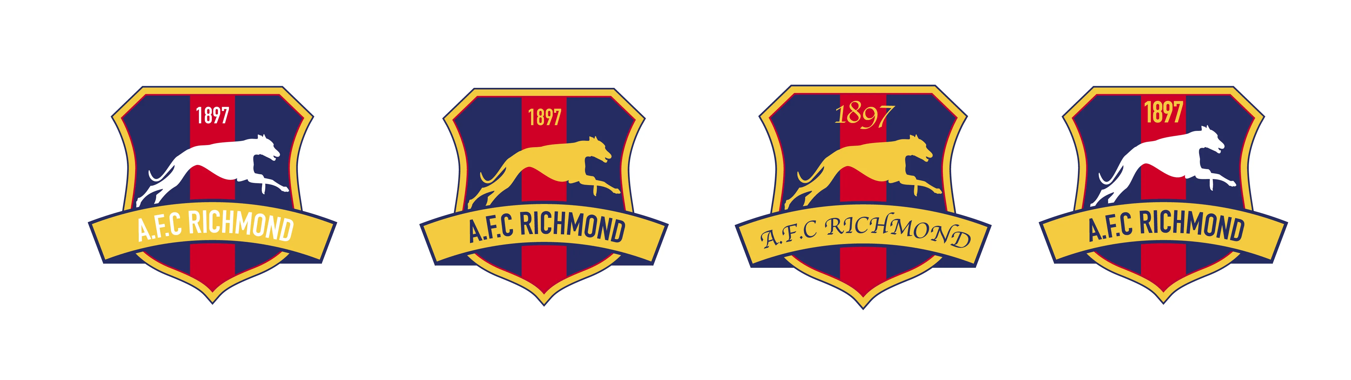
The final shield shape is a fusion of the original design and a respectful nod to several Victorian coats of arms. The Victorian era in the UK, spanning from 1837 to 1901, was succeeded by the Edwardian period. Given that the club was established in 1897, this stylistic amalgamation is historically fitting.
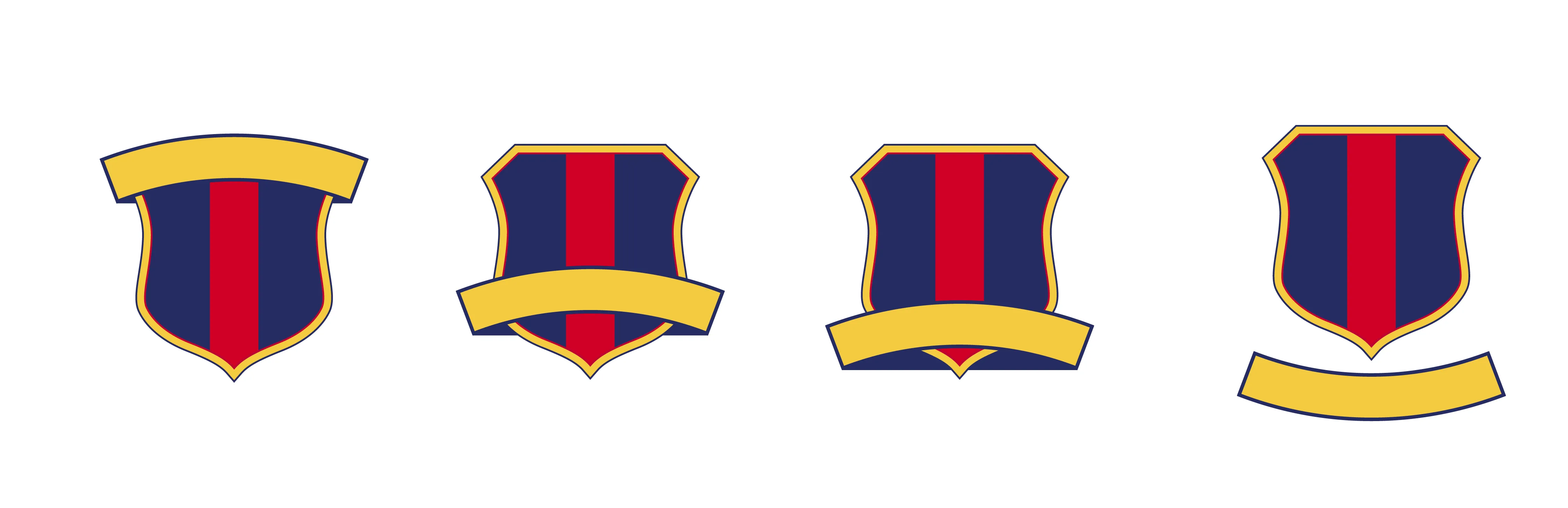
The design incorporates a ‘party per pale’ (halved vertically). One common reason for dividing the field in heraldry is for the purpose of merging two or more coats of arms, signifying alliance, inheritance, occupation of an office, and so on. This practice, known as marshalling, originally took the form of dimidiation, or the fusing of two coats of arms that had been split down the middle. In this context, it is an acknowledgement of the 400 men who were deceitfully enlisted into service at Nelson Road, as depicted in Episode 6 of Season 1.
The red stripe across the field symbolises the fields of poppies and also links the badge to the home kit. It further divides the shield into three, aligning with the concept of the football pitch being split into thirds: the defensive third, the middle third, and the final or attacking third. This resonates well with the strategic gameplay on the football field.
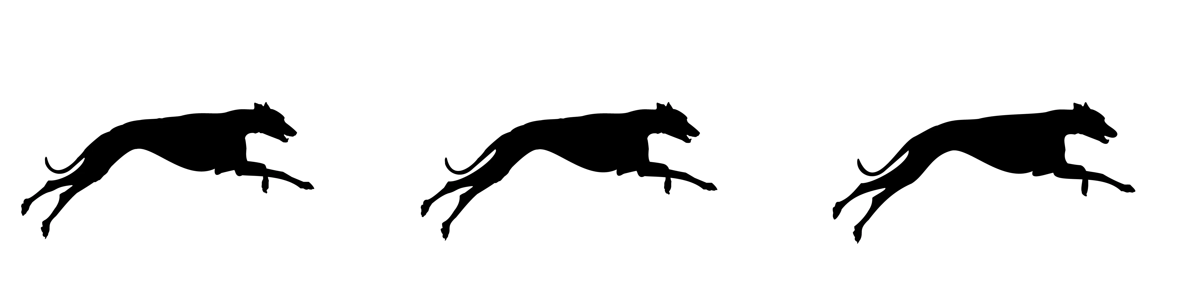
AFC Richmond’s mascot is a greyhound, a symbol frequently associated with faithfulness and guardianship in heraldic tradition. Dogs are perceived as loyal and temperate creatures, symbols of skilled hunters, and were often linked with priests who were viewed as ‘watchdogs’ against the devil. Given that the club is involved in sports, it felt fitting to portray the greyhound in an active or running position. Greyhounds are renowned for their speed, agility, and explosive power. This not only encapsulates the dynamic essence of football but also pays homage to several episodes of the show. For instance, there’s a nod to the episodes where Ted inadvertently reinvents Total Football, and to the moment when Isaac McAdoo, captain of AFC Richmond, sends the ball shooting through the net.
When examining the typography, I wanted to move away from the serif typeface currently used in the show’s badge. A modern sans serif typeface, particularly a condensed one, as it exudes both presence and strength.
Sans serif typefaces, with their clean and unembellished lines, communicate a sense of modernity and simplicity. They are often employed for their excellent readability, particularly in digital formats. A condensed version of a sans serif typeface further amplifies these qualities, offering a compact yet powerful form that works exceptionally well in limited spaces. This choice in typography not only embraces a contemporary aesthetic but also enhances the visual weight and impact of the badge, providing an immediate sense of authority and robustness.
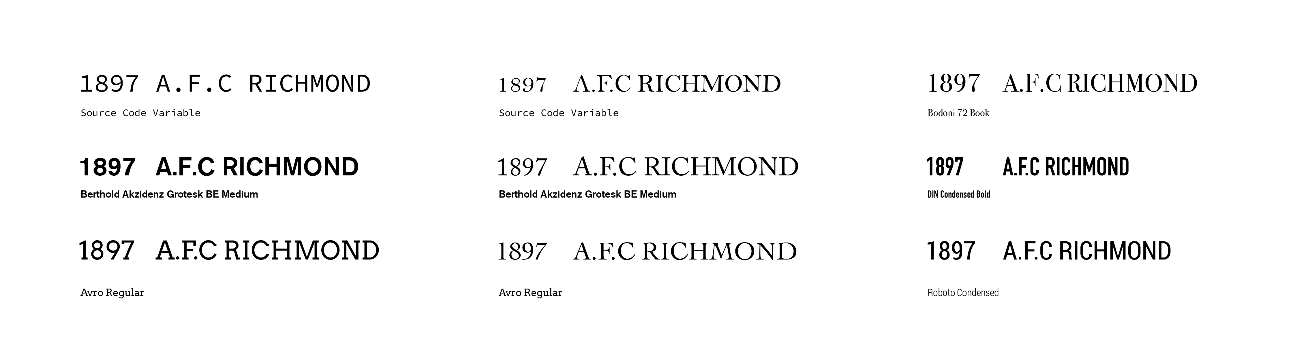
The typeface, therefore, is not just a medium of conveying the club’s name but an integral part of the badge’s overall design. The right choice of typography can significantly enhance the badge’s appeal, making it memorable and easily recognisable, which is particularly important in the context of a football club, where the badge serves as a visual identity on a variety of platforms and merchandise.
A key setting in the series is ‘The Crown & Anchor’, a pub that serves as Ted’s local haunt and a pivotal character in itself, mirroring the on-pitch exploits of AFC Richmond. Among the team’s most fervent and loyal fans are four prominent figures associated with the pub. Mae, the owner who also pulls pints as a barmaid, is one of them.
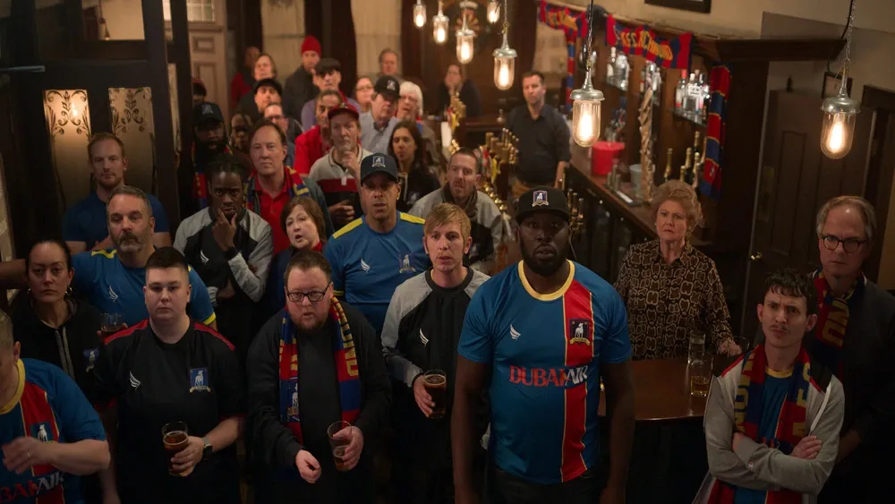
The other three — Baz, Paul, and Jeremy — are lifelong friends and long-suffering Richmond fans. Almost permanent fixtures in the pub, they spend countless hours together, both day and night, usually watching football matches or competitive reality shows like ‘The Great British Bake Off’. In fact, these three friends frequent the pub so much that it almost seems as if they live there. This enduring camaraderie and unwavering support for the club adds another layer of depth to the series.
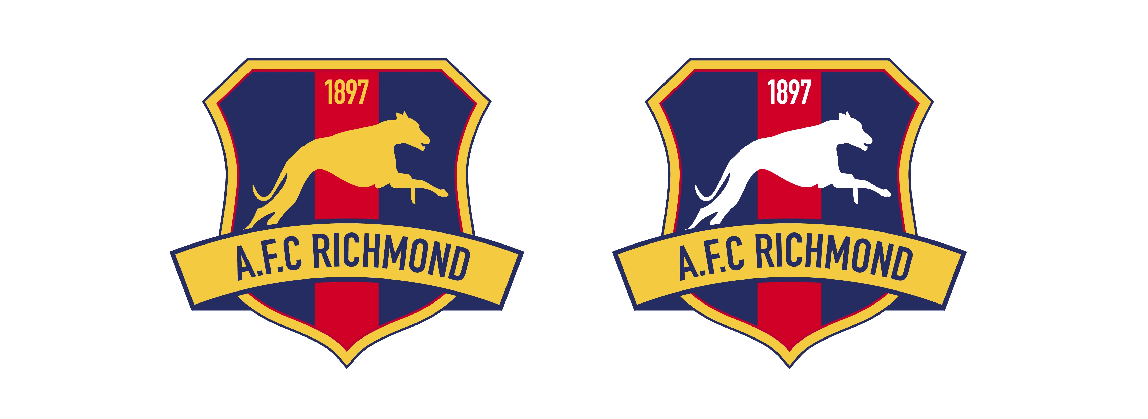
My personal preference for the final design is the badge below, given its aesthetic qualities. However, in recognition of how passionate Mae, Baz, Paul, and Jeremy are about their beloved club, I have prepared another version with the greyhound depicted in white. This is a respectful nod to the original badge, reflecting the deep-rooted love and loyalty of these fans, a sentiment that extends to every aspect of the club, including its emblem.
The greyhound is illustrated in full flight, seemingly running towards the viewer and appearing to leap over the naming scroll at the bottom of the shield. This not only captures a moment of action but also infuses the design with a certain level of dynamism, reflecting the energetic and lively nature of the sport itself.