
Ever opened your phone late at night and been blinded by a flash of pure white? Suddenly, you’re wide awake, squinting, trying to turn down your brightness. It’s the kind of moment that can turn even the most stubborn dark mode sceptic into a believer.
But dark mode isn’t just a trendy feature for night owls; it’s a feature that makes your design more inclusive, flexible and accessible.
For many of us, dark mode is a preference. It feels sleek and modern which is why it’s a popular choice for contemporary tech companies like Apple. For users with light sensitivity, migraines or visual impairments it’s not purely an aesthetic choice.
Bright white backgrounds can trigger discomfort, fatigue, or even pain. For users with ocular conditions such as cataracts, dark mode can make it easier to focus, as there is less light entering the eye.
Ultimately though, users have different preferences and experience your website differently. What works well for one user might not work for another. Flexibility, and the ability for the user to choose what works for them is critical. Ideally, your website should match the preferences the user has set on their device, providing a seamless experience.
Designing a good dark mode isn’t as simple as flipping your palette. It requires thoughtful adjustments across your interface to maintain clarity, accessibility, and brand identity.
Contrast
Your colours still need to meet accessibility standards (like WCAG contrast ratios). A vibrant brand colour that looks perfect on a light background may fail against a dark one. Sometimes, that means introducing new, dark mode-specific shades.

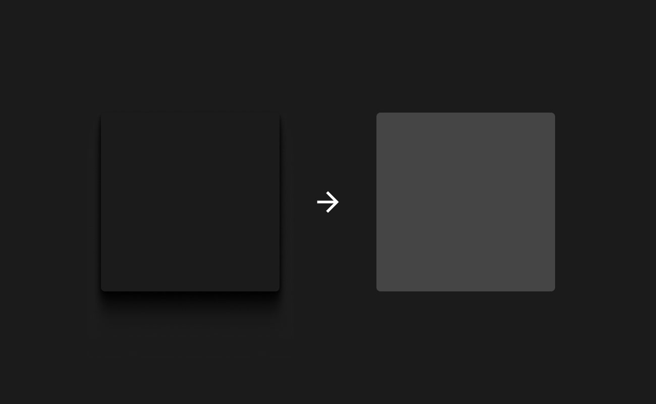
Black and White
Pure black (#000000) backgrounds with pure white (#FFFFFF) should be avoided, as they have too much contrast. Instead work with very dark greys and soft off-whites to make the contrast more manageable.

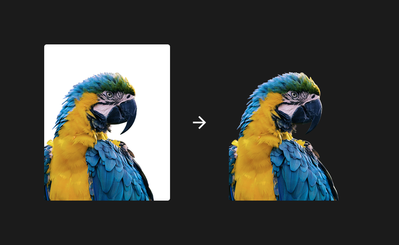
Images and graphics
Non-transparent images often create issues in dark mode, retaining a harsh white box behind them. Use a transparent background where possible and ensure that the colours in the image display well on a dark background.
Depth without shadows
In light mode, shadows help create a sense of depth and hierarchy, which aren’t visible against a dark background. Instead, use lighter shades of grey to elevate surfaces and differentiate layers.
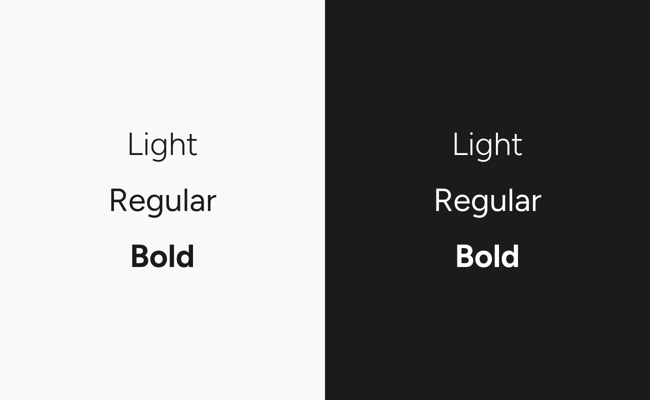
Typography
Fonts can display differently in dark mode due to the irradiation illusion, where lighter strokes appear bolder on dark backgrounds. Make sure that heavy font weights remain legible in dark mode, and that contrast is preserved between differing weights.
These are just some of the considerations that should be given when designing in dark mode. Get it right and you’re not just flipping colours; you’re building a more comfortable, accessible, and user-friendly experience.
Want to build a digital experience that works around your users, not the other way around? Get in touch.